
How to easily implement a visual marketing plan and the psychology behind it.
Visual content marketing is an essential part of any visual marketing plan. We already know that the majority of people are visual learning and prefer to consume visuals, rather than any other format, so there’s no wonder so many visual social media platforms, like Instagram and Youtube. However, not just any picture will do.
Does psychology help with marketing?
It comes at no surprise that there are a range of psychological theories incorporated into a marketing | visual marketing plan. By understanding how and why people think and act the way they do helps marketers and business owners; create more effective marketing, find more potential customers and persuade them to take action.
What is the psychology behind visual marketing?
We’ve all heard of certain classic marketing strategies:
- the principle of reciprocity (tit for tat) which comes from their belief system
- scarcity (fear of missing out) which leads to motivation
- social proof theory (if they liked it, I’ll like it) which influences their perception of you
But how to do you effectively show rather than tell these in visuals?
How to Choose the “Right” Image?
Whether you’re scowling through Canva’s stock library or creating your own. You need to find one that will connect with the viewer on a personal and/or emotional level and deliver your message effectively. Unfortunately, there’s no one plan that suits all, because it depends on who you talking to and who you are. This is when you need to combine psychology with design; including subject, visual perception, composition and the psychology of colours all together. After all first impressions mean a lot.
What makes visuals appealing?
Everyone has their own personal tastes, however there are a few universal principles that seem to work for almost everyone.
9 Visual marketing techniques you need to try
Gestalt psychology is a visual perception theory. Visual perception is the ability to organise, and interpret what we see. He had several principles which are used in both marketing and photography.
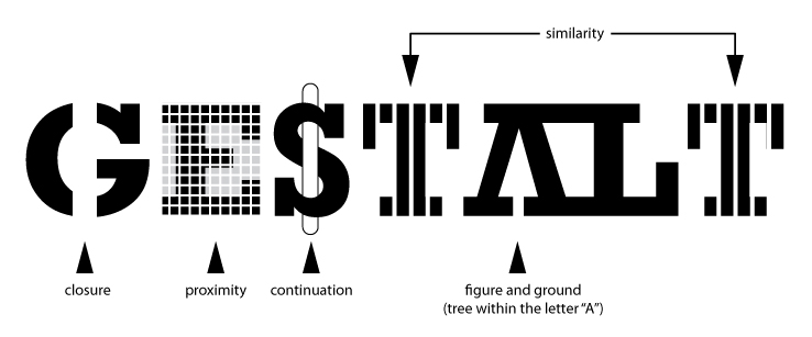
Gestalt Visual Technique #1 – Law of Closure

The gap / negative space between the E and X creates an arrow, and once you’ve spotted it. It’s hard to forget, but they’re not the only one to use this technique. Adobe, Pinterest, Levi’s and Coca Cola. If I asked you what colour coca cola is you’d probably say red, but actually it’s a white logo over red. This is the power of using colour psychology as well. In photography we call this negative space. You can use negative space to emphasise a subject, as there’s nothing else to look at or gives the subject some “breathing room”.
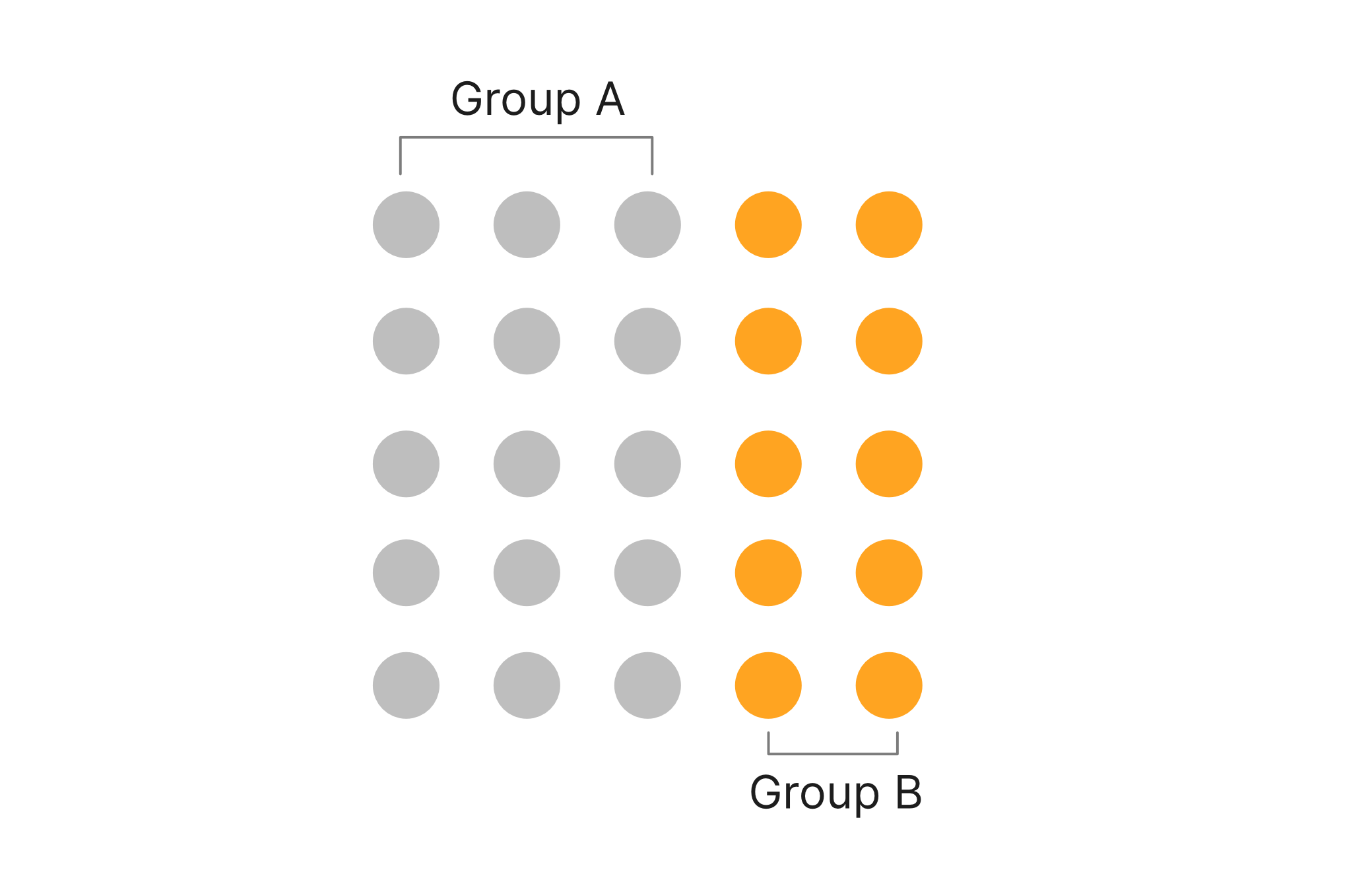
Gestalt Visual Technique #2 – Law of Proximity
We subconsciously perceive objects that are close to one another as within the same group. Think headlines to images and prices to pictures.
Gestalt Visual Technique #3 – Law of Similarity
Objects that are similar are seen together as a group. In photography we use compositional rules of repetition and patterns to group things together, but it can be so much simpler. Section of your website group its contents together. Social media campaigns with similar designs across platforms will be associated together. This is apart of theory of branding your visual content builds your brand identity.


Gestalt Visual Technique #4 – Law of Continuity
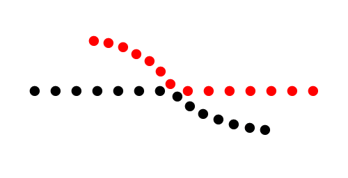
People perceive lines as continuing movement. In photography we call this leading lines in composition, and is frequently used to guide the viewer through an image. This can be implied like the law of closure and someones body langauge (eye gaze or pointing) or literal lines of subjects.
Gestalt Visual Technique #5 – Law of Figure-ground
Brains tend to perceive objects as either being in the foreground or the background. In photography you can choose to emphases one of these by determining your depth of field and blurry out the area you don’t want to focus on or create interest and tension by using a larger depth of field and focal point. As a general rule, if the foreground is in focus thats where people will focus first.
Visual Technique #6 – Order and Symmetry
Symmetrical and balanced objects seem whole and complete creating a feeling of harmony and ease. It’s a common photography composition for architecture, landscape and reflects. However, you can easily create your own.

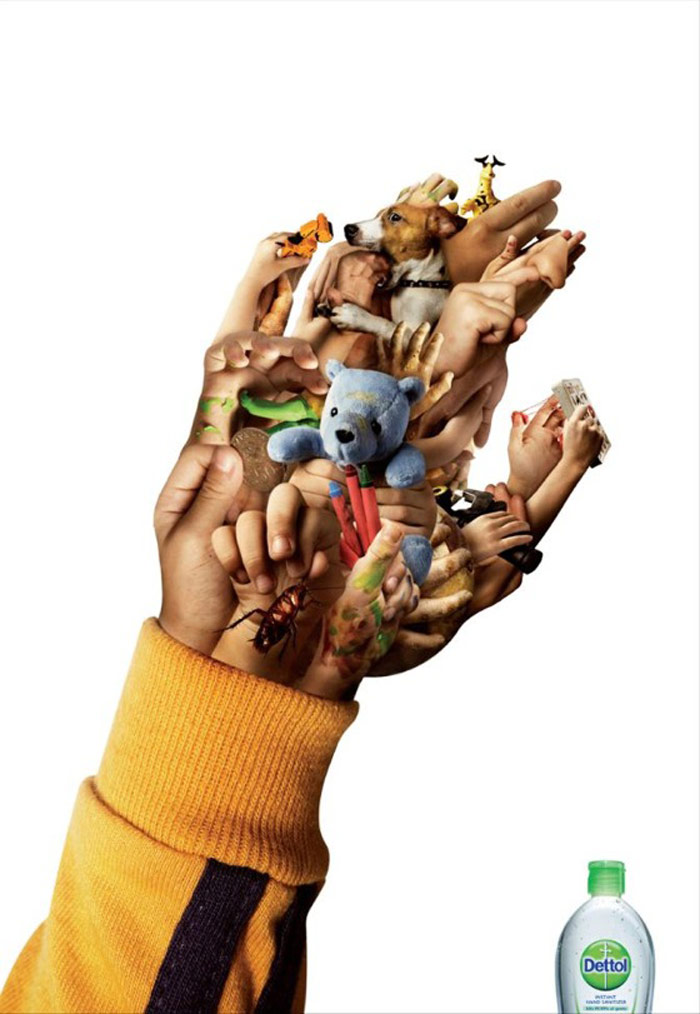
Visual Technique #7 – Emotional Appeal
It’s believed that there are many factors that influence us and our decision process, but emotions are the top of that list when it comes to influences us to take action.

Crisis Relief Singapore – Liking Isn’t Helping
Triggering an emotional response helped them two-fold:
- They generated the awareness that people taking actions on social media by liking photos is not helping or solving the real cause.
- They also saw an increase in fundraising.
Visual Technique #8 – Framing
Framing is strategically choosing the context of how your product / services are perceived. Showing behind the scene images builds trust and excitement, while providing more context can convey your message quicker.
Visual Technique #9 – Colour Psychology
From the moment we learn how to see colour, at around 4-5 months old. We start to build associations with them. These associations stay with our subconscious throughout our lives. The trick is to know your viewer and predict their interpretations.
If you want to know more about The psychology of colour, check out my post all about it. (Kinda geeked out on that one 😉 )
Visual technique # 10 – Typographic Composition
The visual techniques you choose will depend greatly on what you’re trying to portray. When creating your own graphics, keep it simple.
Down to font psycology.
- Serif: authority, tradition, respect.
- Sans-serif: clean, modern, stable.
- Slab serif: strong, modern, solid.
- Script: feminine, elegant, friendly.
- Modern: fashionable, sharp, intelligent.
If you’re looking for a tool to create your graphics in. I recommend Canva for beginners and for its quickest (Yes, I use it every week) but I also use Lightroom for my editing and there’s a free app to get you started. Remember these techniques can be found in other people’s photo, so if you’re a stock lover rather than creator. That’s fine, but you’ll need to decode and analyse the visual media.
So now you know there’s more to the photos and visual graphics that you create. When you decide to create your own visual marketing plan, remember to:
- Think about what you’re trying to portray and how you want them to feel.
- Figure out the best style and techniques to use
- and finally love what you do. It’s still an art form in its own right.
Did you find this article helpful? Which visual technique is your favourite?
Looking for some more advice?


