
Psychology of colours in marketing
From an early age we start making associations with colours, however these are influenced by our culture and demographics. As a content creator it’s important for us to understand the psychology of colour in marketing and how to effectively use the right colours to market your products.

What is the psychology of colour?
Colour has a deep and often subconscious effect on our behaviour. In marketing and branding, colour is often used to persuade or influence us.But the psychology of colour is not simple.
Red represents passion is a generalisation.
Red is first colour we see, and start to form associations for the this early age. A red truck is a fire engine, but it’s also the colour used for danger, love, courage, pain etc. So how you know what the colours are actually suggesting?
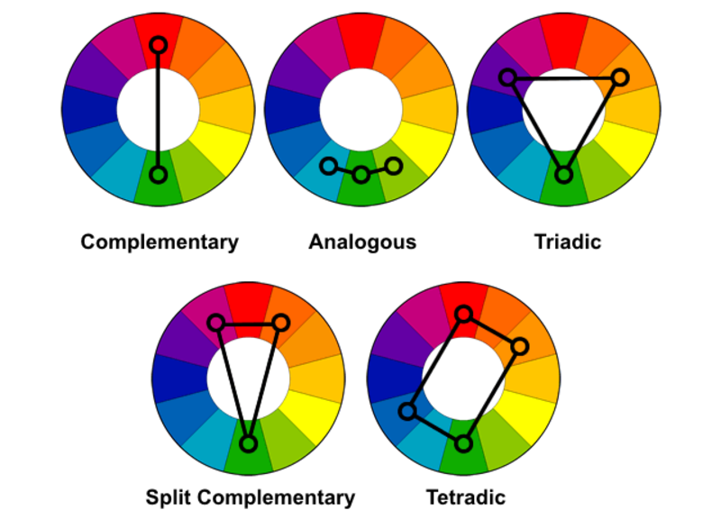
But before we get into all of that, how does colour work? We all know the tradition colour wheel, but it’s how we use it to choose our colours that matters.
Complementary colour have a high contrast, and is an easy way to create a juxtaposition (resulting in a longer view time). Alternatively, you can analogous colours to create pleasing colour palettes putting our viewer at ease. Who knew colours are so emotional?
#1 biggest mistake I see when using colours in marketing
The hardest part of colour psychology is that colours on screens and inks in prints differ: CMYK and RGB.
.jpg)
CMYK stands for Cyan, Magenta, Yellow and Key (Black).When you combine all four inks you get an imperfect black.
RGB stands for Red, Green and Blue.The colours are not ink but light this time, and when you get different levels of intensity you get different colours. It starts with black and as light shines through you get different colours.
Did you notice that the primary colours have changed from the classic red, yellow and blue to red, green and blue.
This has an obvious impact on colours for digital content, especially when combining them and looking at pure colours.
How can you change your colours?
Pure colour / Hue are located on the outer edges of the wheel.
Tints are when white is added, and traditionally are softer pastel like colours.
Shades are when black is added and create a duller version.
Tones adjust the colour by adding grey and create a multitude of colours.
Why are these colour variations matter in marketing?
Ever wondered why some things just work while others done. The chances are it’s a result of mixed messaging. The various shades and tints of blue are perceived differently. Bright blue skies #87ceeb symbolise that fresh airy feeling, while darker navy holds trust and reliability, maybe because a lot of banks, technology companies and the police use a darker blue. #003087. Our interpretation of colour, comes from our cultural upbringing.
- In North American, blue symbolising trust and authority
- Western countries; use phrases like “having the monday blues?” suggesting melancholy.
- In China light blue is a feminine colour
- In Latin American and Judaism light blue is symbolic of the Virgin Mary and holiness.

This is why you need to know both who your audience is and A/B test your colours and use Gestalt principles to help guide your designs.
If you want to do a deep dive into this. I recommend a study, Color Psychology and Color Therapy by Faber Birren, is all about how people associate different feelings and thoughts with colours.
However if you’re looking for a succinct summary, here you go:

When it comes to choosing your colours you need to test, because while blue is the most popular colour if you use somewhere like Facebook it’s just coming to blend it. Planning your visual content and then testing it will help you figure out the best colours for both you and your audience.


